I'm Ron - a product designer who creates scalable, intuitive, and user-centered solutions for digital products. I have been around for 4+ years designing for SaaS for both enterprise and customer.Currently based in Indonesia, working remotely with global teams.
Case Study - Design System
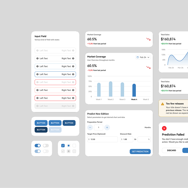
Increasing SaaS CMS Design Sprint Efficiency through Scalable Design System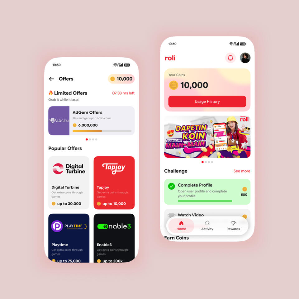
Case Study - Mobile App
Solving User Retention Problem on a Loyalty Mobile App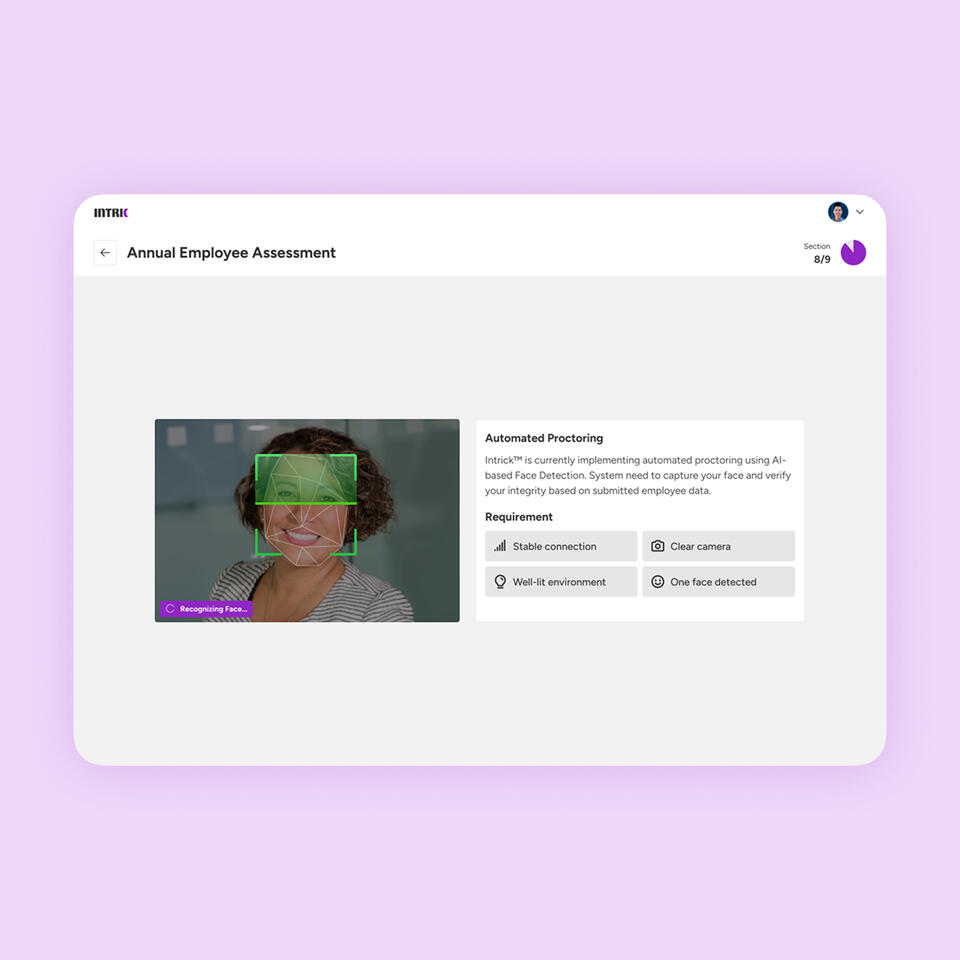
Case Study - Web (Under Construction)
Accessible Design for Mass-Recruitment Platform
Case Study - Web (Under Construction)
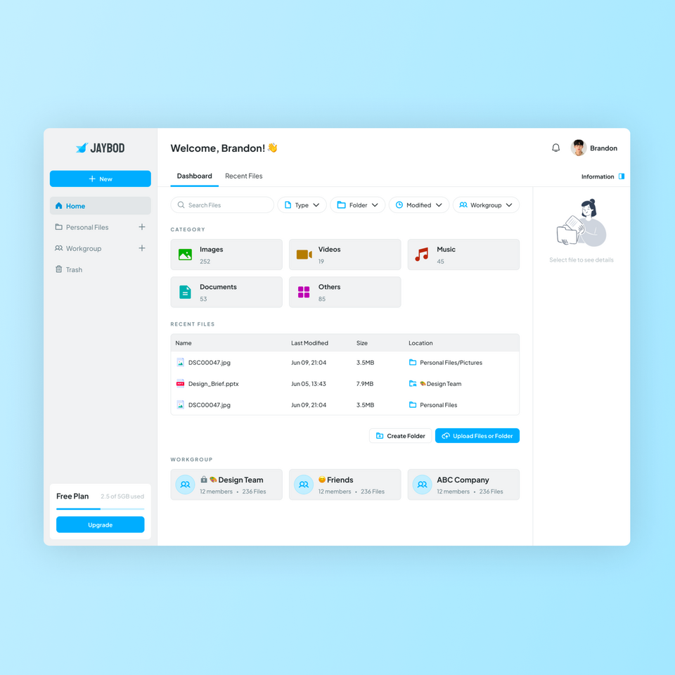
Workgroup Feature Design for Cloud Storage Provider | UI/UX Case Study & Logo Design
Increasing SaaS Design Efficiency through Scalable Design System
Overview
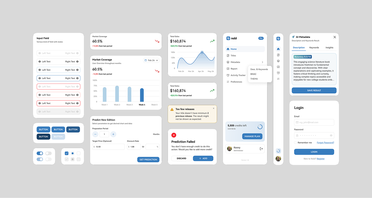
Nobl Design System is a comprehensive component and visual guideline documentation made to support Nobl's internal and enterprise-focused CMS. Nobl is a SaaS that helps publisher managing their books to be sold on major e-commerce platform.
Role
Design Auditor
Visual Designer
Duration
2 weeks (MVP Ready)
Tools
Figma
Kigen Design System Builder
DeepSeek AI Assistant
Previously in Nobl
Nobl CMS was still under development with several feature shipped. Despite the product was already in use, it had no prior documentation of the design.
This condition led to several major problem:
1. Inconsistency
Numerous components had different size and visual. There was unclear rule about which components to be used in certain condition.
2. Cognitive Load and Performance
Product owner consistently told the team about user's difficulty to use a feature and several part of the software that didn't perform well in aged machines.
3. Delivery Time
A design sprint could last up to 2-3 weeks just to handle 1-2 features. Sometimes it didn't include iteration time needed if there was any additional feedback along the way.
After an important discuss, product and developer teams decided to allocate 2 weeks for building the MVP of design system, later established as Nobl Design System.
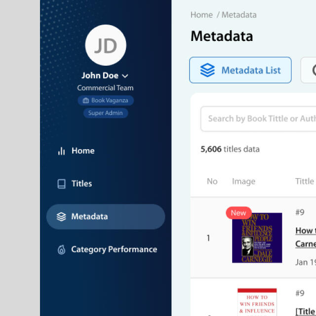
Poor visibility on the profile tags
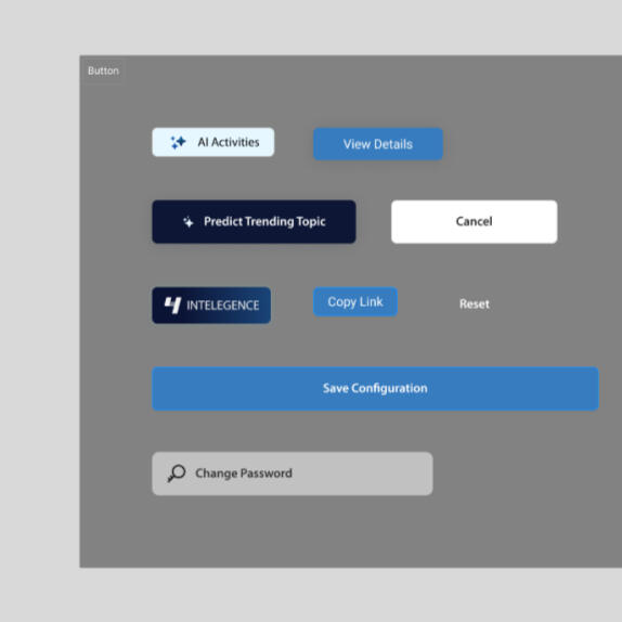
Inconsistent button shapes and sizes
Finding Perfect Methods
As a solo designer, building a design system is a huge responsibility. I need to do design audit, create a component inventory and grouping, etc. all by myself. I started to do a deep research, exploring around the tech giants and their approach to design system like Google's Material, IBM's Carbon, GitLab's Pajama, Alibaba's Ant Design, and the others.
However, since this design system was going to be used by CMS, I need to consider a design system that covers data-related components, highly accessible, and scalable.
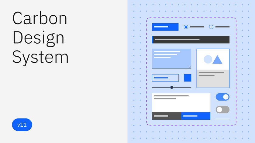
Carbon Design System by IBM
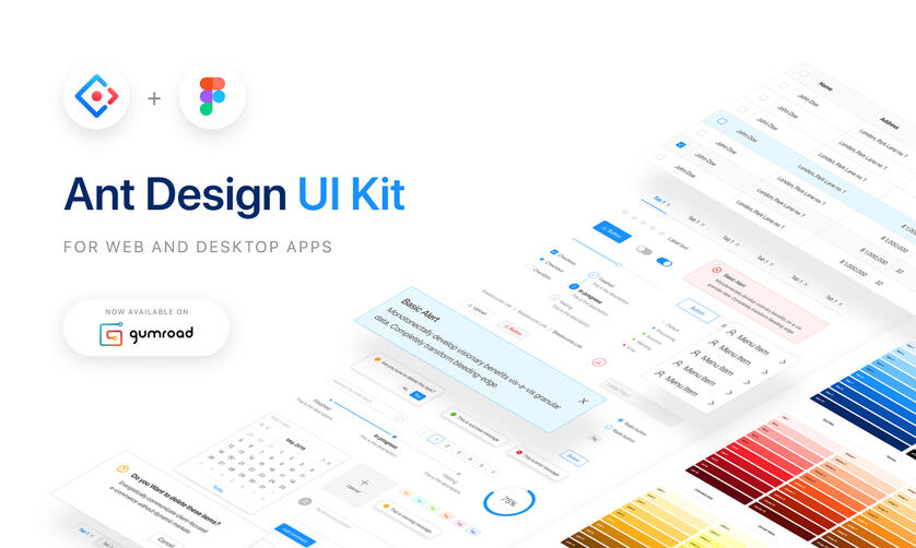
Ant Design by AntD (Alibaba Group)
Documenting What's on the Plate
While I started documenting the components, I asked DeepSeek to do a short audit based on several screenshot we found them to be the best representation of all screens in the figma file and here was what AI said about the design.
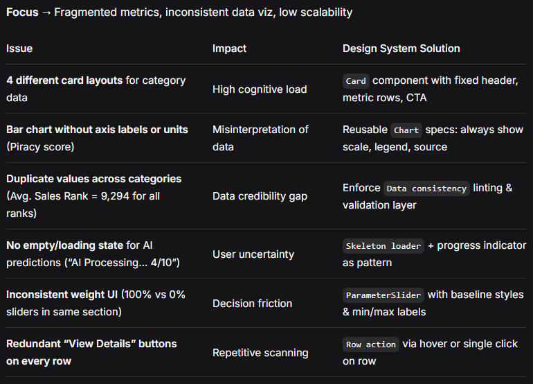
Audit Result by DeepSeek
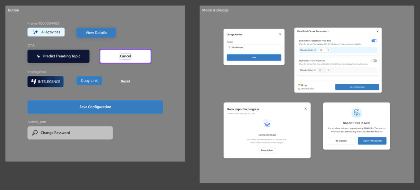
Example of Grouped Existing Components
This result mostly aligned with the previous discussion, especially the cognitive load, repetitive scanning, and user uncertainty that could lead to unneeded iteration.
Aligning Visual Style
As a derived product under established company, Nobl needed to respect the company's style guidelines. However, there were some limitations from the existing brand guideline documents.
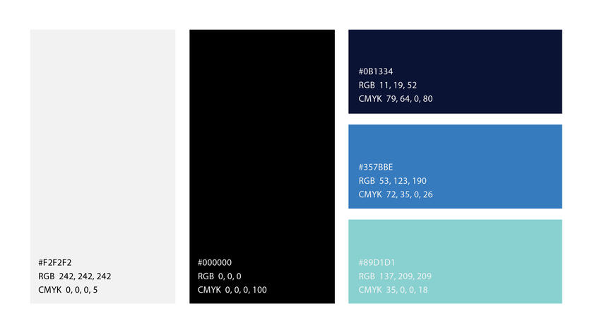
Brand color
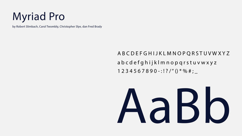
Brand Typography (Myriad Pro)
1. Lacked of color shades and tints
The existing guidelines only showed the color used for marketing and branding purposes.
2. Improper typography for digital product
The current brand guidelines used Myriad Pro as the main typography which has imbalance spacing for digital product adaptation.
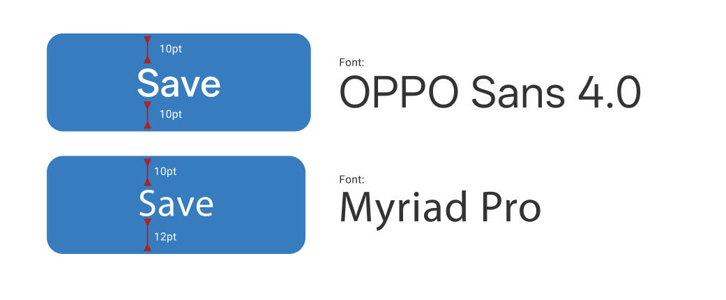
Example of use from OPPO Sans and Myriad Pro and their spacing amount.
To address this concern, we decided to adapt one of the brand color #357BBE as the primary color with its variation of shades and tints. As for the typography, we decided to use system font (varies with each device) to ensure the best performance and better accessibility.In the example shown here, we used OPPO Sans as the representative.
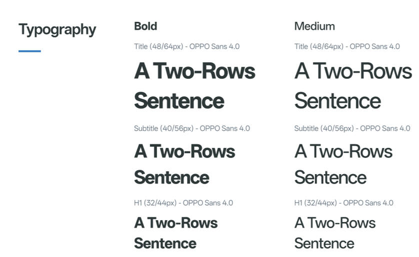
Typography Style using OPPO Sans
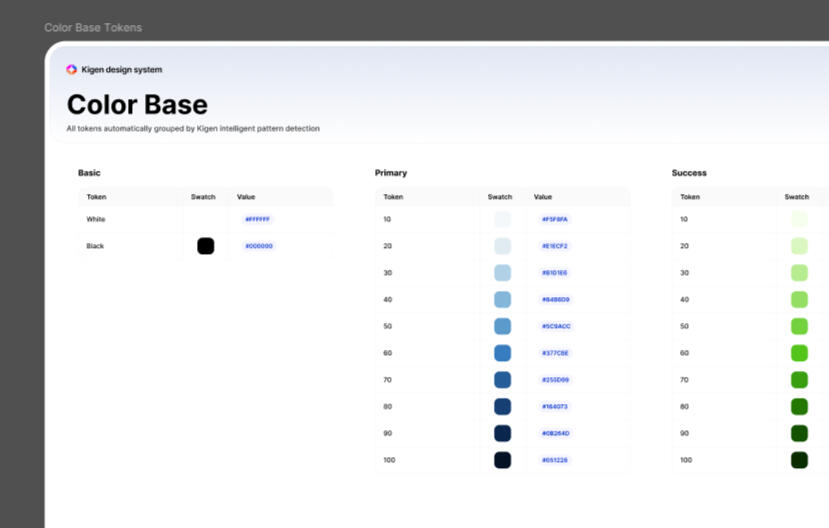
Brand Color and Shades
As for the icon, we used Ant Design 5.x icons with several custom addition to cover our specific features.
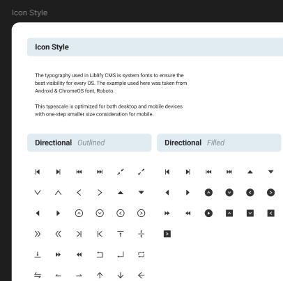
Icon used in the design system
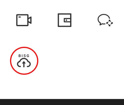
One of the custom icon I made
Starting Small through Atomic Design
Atomic Design follows the principle of chemical equations which combine 2 or more atomic elements to become a distinguishable molecules. In the design context, atoms could be the simplest components that could not be broken down into individual functional components.

Atomic Design by Brad Frost (source)
In this project, since we need the MVP to be ready by 2 weeks, we decided to redesign the button, input, and control (radio, checkboxes, etc) first. These components fell under atoms.
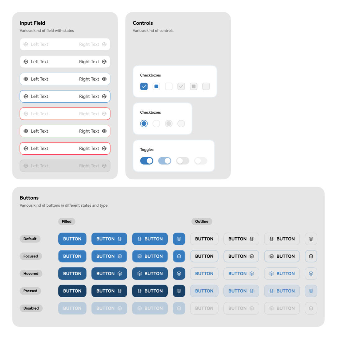
Earliest components made in Nobl Design System
Before combining these into molecules, I tested the components to make sure they comply with WCAG accessibility standards
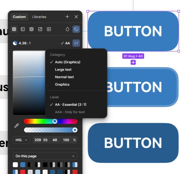
Tested component to pass WCAG standards.
The Design System
These are the examples of product with design system implemented
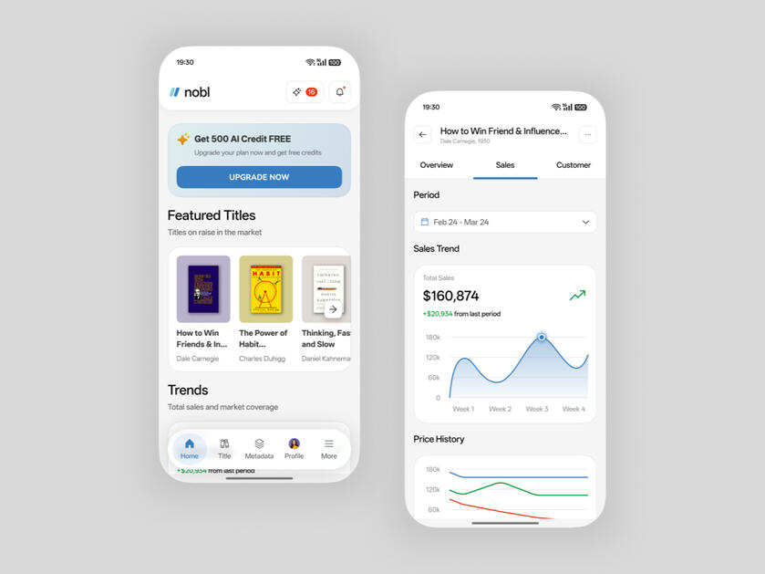
Mobile version of Nobl
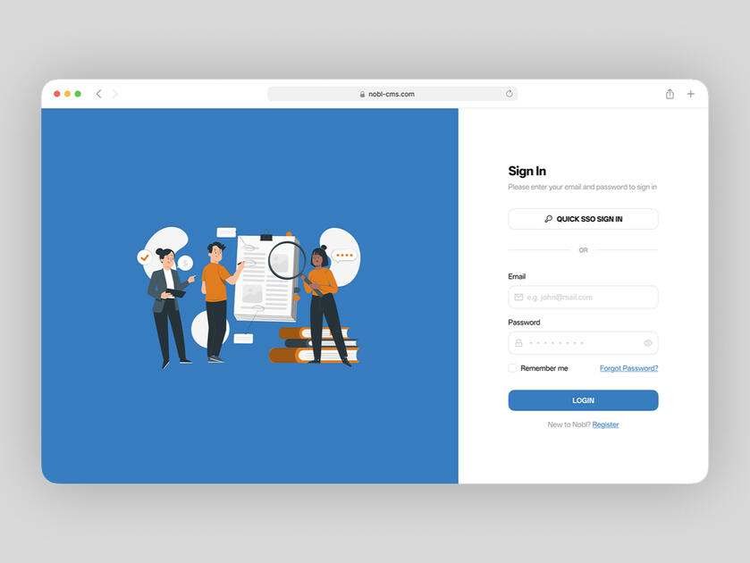
Login Screen
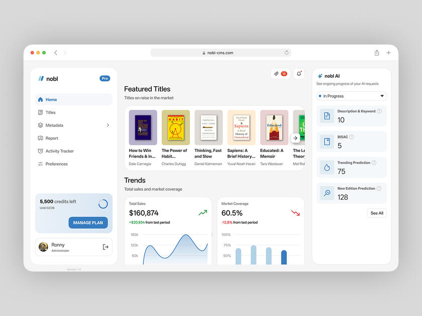
Dashboard
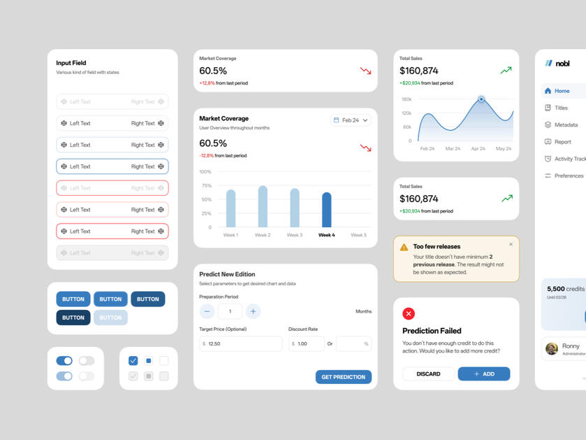
Templates Gallery
After the MVP of this design system was released, there are significant improvement that could be seen from sprint health in Jira, the platform our team used to log a sprint.
| 2x Faster Design Process | Faster hand-off from 1 weeks to 1-2 days | Flexibility to create another product within company |
|---|---|---|
| A design that needs to be done in 5 workdays could be completed in just 2.5 days with reusable components and tokenized color style. | Design system helped the developer to understand how the design was like faster and reuse existing components | The next step from this platform is creating a landing page for marketing purposes. This landing page will use several components and foundation from design system. |
Solving User Retention Problem on a Loyalty Mobile App
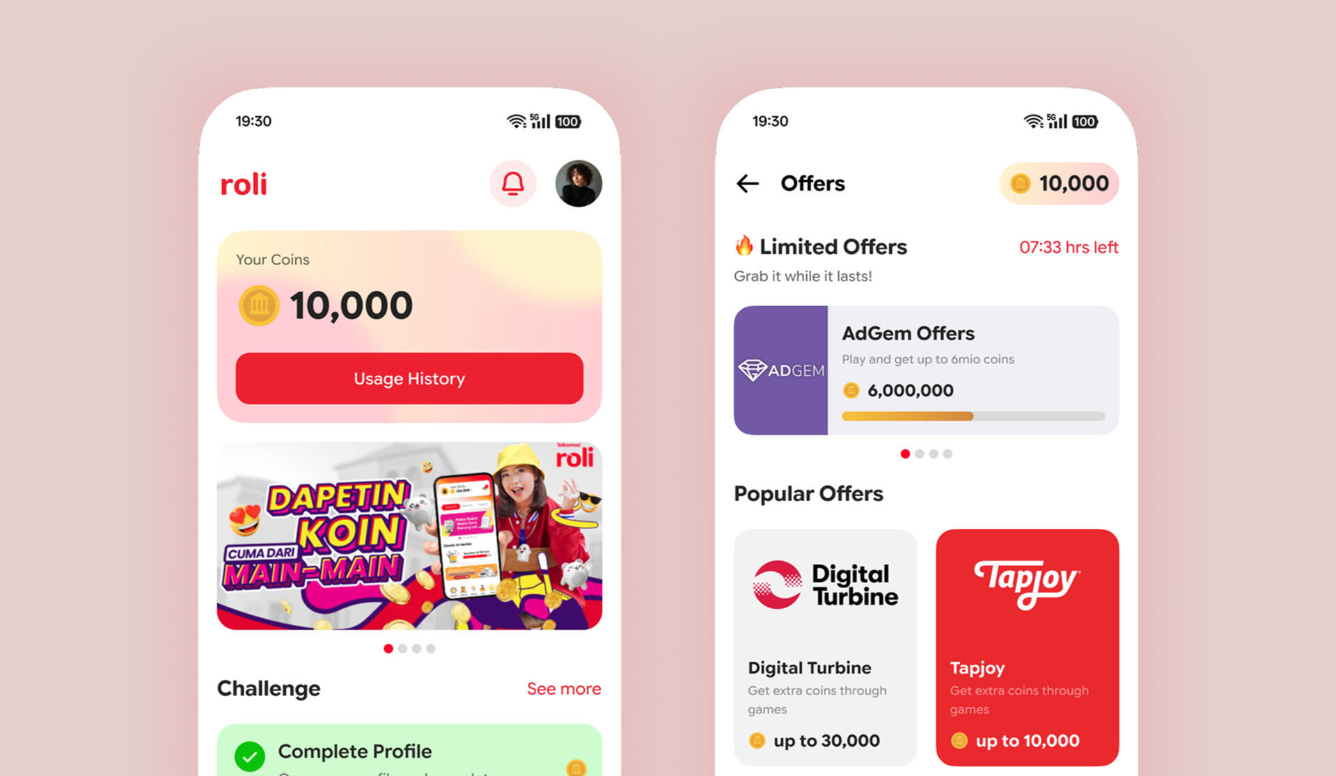
ROLi is a loyalty platform that allows user to earn points and exchange it into various rewards such as phone balances, vouchers, or purchasable game items.
Currently ROLi suffers from low user retention and almost 100% user drops in ‘offerwalls’, a feature where user can earn points.
Role
UI/UX Designer
Duration
1 month
Tools
Figma
Maze
Phase
In this project, we followed the principle of design thinking to iterate the design processs better.
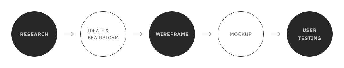
Finding the Why
I gathered 8 people from different background to do preliminary usability test of current ROLi’s interface. The test was focused on offerwalls feature with 2 scenarios; Guerilla Test on how to reach offerwalls page from homescreen and Guided Test to earn points through watching video ads after reaching offerwalls page

The result I got from this test is quite interesting as we could already see that the satisfaction rate is quite low at ~71%
Pain Points
Apart from the statistics, I also recorded some of their direct feedback when the participants were conducting the test.
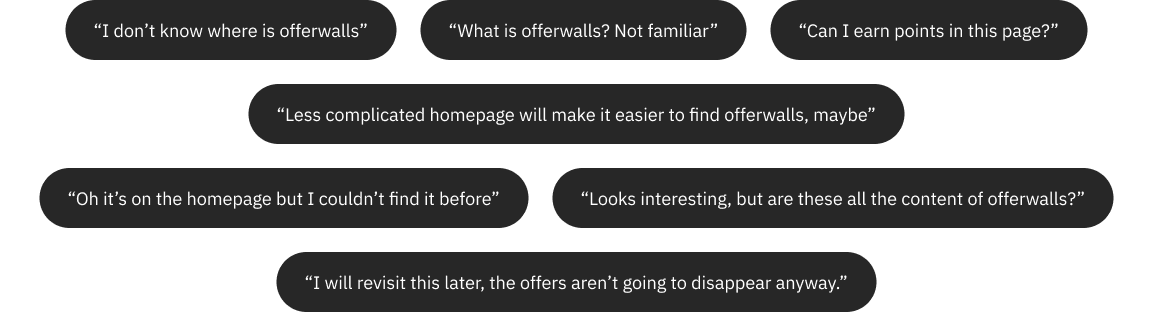
Based on the pain points, how might we redesign the offerwalls feature that it could be engaging and more stand out to user so they could access the feature easily?
What to do?
In this project, we are going to focus to improve user flow and experience while accessing offerwalls feature. Thus, we need to define steps to get into the goals.
The steps are:
1. User opens the app
2. Registering themselves
3. Exploring the homepage
4. Finding out the offerwalls feature
5. Clicking one of the offers.

Based on the steps, I also did a small examination from two competitor app with similar functionality: Tyrads & Google Opinion Rewards.
Sketching & Wireframe
Based on the research, user mainly had problem in finding out the feature and making them engage with the feature. In order to make the use case successful, I tried brainstorming some ideas and the results are:
1. Redefining user flow and refining visual components
2. Adding more space in the homepage
3. Adding a timed reward as a new feature
4. Using more accessible font weight
These results had considered some limitation from the app development, such as project duration and brand guidelines from the client (ROLi is tied to a company with certain brand guidelines)
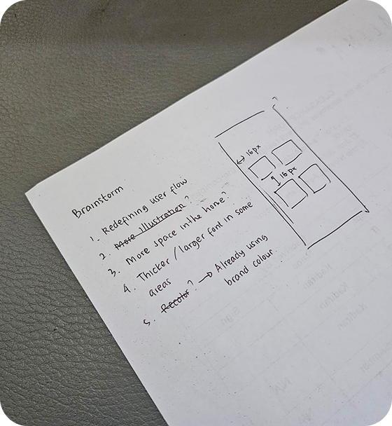
Brainstorm
I decided not to change the flow but instead I made the offerwalls more prominent and changed the overall menu structure into more familiar one.
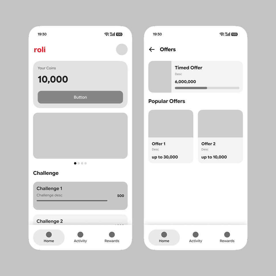
Wireframe
Now the main menu is on the navigation bar and I moved the additional services like kreasi (creativity) and cerpen (short story) to the homescreen.
First Usability Test
I conducted a usability test of the wireframe to see if the solution proposed solves the problem. The test result with the same participants showed a quite significant change. More of them were satisfied with the wireframe, although there were still a number of them who find offerwalls feature difficult.

However, I found that I missed some points to solve: order and space between items. To save time, I decided to implement these feedbacks in the mockup.
Visual Adjustment
After discussing with the client, we agree to tone down the brand color a little bit warmer and changing the typography into more modern one.
As for the typography, ROLi originally used Poppins but we changed it to Google Sans because it has more distinguishable letters, such as lowercase 'a' and 'q'.
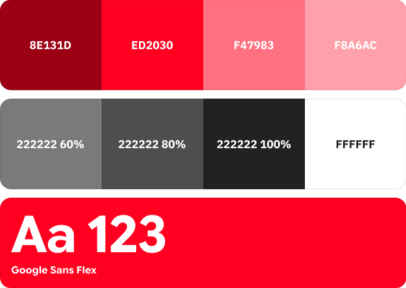
Color and Typography used
Result
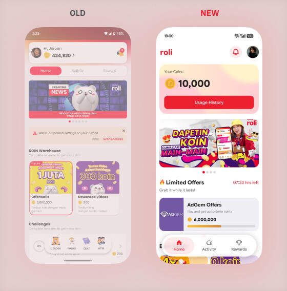
Homescreen
The navigation on the homescreen now consists of main menu; home, activity, and rewards. User's coin is made bigger to give user easier way to check how much they have left. There is also a shortcut to the timed offers right under banners.
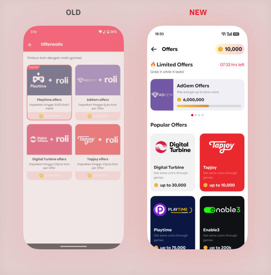
Offers
On the new redesign, timed offers were placed first to catch user attention first. Each of the offer section were also redesigned to match the visual revamp. On the top right, there is also information about the coins user have now.
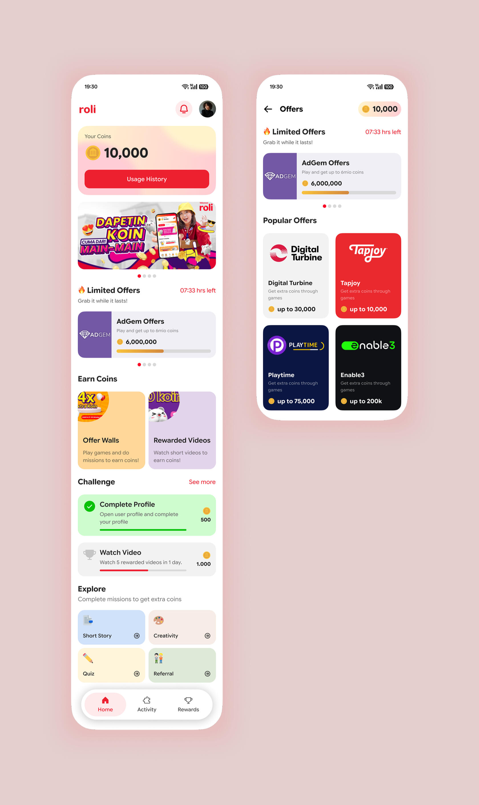
Full design view
Final Usability Test
The test result shows that no more users are having difficulties and they will revisit the offerwalls feature. Although there are still 1 participant who is not satisfied with the content, the solution already shows how the feature is now more interesting and easy to access.

Takeways
From the feedback and test result, it might show that people are satisfied but we still need to test the design to more users to get the real result. This could be done with more dedicated time for research and more feature to be explored.These problem could be solved in future project iteration.